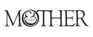
I design this a couple a weeks ago and I was kinda proud if the way it turned out, so I thought I’d share. This Jennifer & Child was a logo was designed for a collegue of mine who has recently gone on maternity leave. I wanted to design something nice and clean. I remembered the “Mother & Child” logo designed by Herb Lubalin in 1965 and decided to make it a bit of an homage to one of my most favourite logos ever.
Herb Lubalin’s piece is amazing… almost every design student I’ve ever met has looked at this in awe. Of course I wasn’t able to copy what he had done entirely for my collegue’s because she didn’t have an “O” in her name to be able to place the child in a womb. Still… I’m happy that I was able to use the “&” as a baby and the letter “e” in her name. Not nearly as clever as the original… but a decent homage nontheless.
—
steelie


This is really great! And — I'm not just sucking up 'cause you're my friend, promise — I like your design better than the original. There's just something about the way 'jennifer' looks written out lowercase with the '&' doubling as the 'e,' complete with child…
Seriously, great job. I may have to contract you to design a business card logo for my freelancing "business." 🙂
Very cool! I love it!
Fantastic! I'm with Jen about how it reads — very smoothly. And I think it's a nice update of the 1965 version, incorporating more contemporary trends (like the use of all lower case). What's she using it for?I recently saw Helvetica which is a feature-length film about that font, marking its 50th birthday. It was awesome! I was so amazed at the pre-computer font designers who drew them all by hand. So tedious and admirable…
Jen: Thanks for the compliment but in all reality, I’m pretty darn sure I wouldn’t have come up with something this clever on my own. The lower case works well with “jennifer” but wouldn’t have worked well with “MOTHER” because of the way Herb Lubalin used the “O”. I forgot to mention, that we did know she’s having a boy, thus the blue “baby &/e”.Thanks again, and of course I’d love to help you out. Let’s talk.Baloo: Thank you muchly. It was a fun little project. :)Semblance: Thanks! She’s not really using it for anything in particular. We threw her a bit of a baby-shower here in our design centre. I kinda organized it and designed this as the “logo” that went on all of the decorations.I’m thinking I’d like to see that movie. We had to learn by drawing letters by hand at NSCAD (which took forever BTW) which makes you appreciate the subtle differences a lot more. Tedious? Yes. Fun? Yes, that too.
You did a beautiful job of combining elements of Lubalin's work with your own skills. Really, it looks wonderful! It's so clean and fresh– just what you aimed for, too.Oh, and I'm sorry if I haven't been keeping up with your Vox as much as I used to. (-___-) For some reason, your Vox never appears newly updated where I check on my Vox. I'll have to make sure to stop by more often. I hope you're doing well!I also saw your comment a while back– the one about the Vox challenge I made with asking for photo ideas. I actually haven't had the chance to complete the project yet. I've been swept up with classes lately. I'll have more time during the summer. Plus, the weather will be a lot better for outdoor pictures. ^__^ Thanks so much for being patient, Steelie.