Show us a logo you really love.
The WWF logo (no, not the World Wrestling Federation)…
Not only do I believe what this organization stands for, I LOOOOOOVE their logo. I think it’s a wonderful balance of positive and negative space — Oh. My. Yes. The negative space. It’s simply not that easy to create a logo that relies so heavily on negative space that reads as well as this one does.
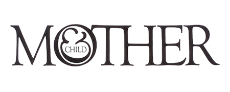
Mother & Child, by Herb Lubalin…
What can I say… I know I posted this one before but I’m just blown away by it every time I see it. This Mother & Child was a logo for a magazine that has never been published. It was designed by Herb Lubalin and Tom Carnase in 1965. And remember, back then it would have been DRAWN BY HAND.
I love logo design.
—
steelie
Hmmm… I wonder if I should a “steelie’s Top Ten Logos” list.
Might be fun.

